Why Countries Look Bigger on Maps Than They Really Are
Why does Greenland look bigger than Africa on most maps? Is Russia really that massive, or is the map lying to us? Because the Earth is a sphere flattened onto a 2D surface, standard maps use the Mercator projection, which drastically stretches landmasses near the poles while shrinking those near the equator.
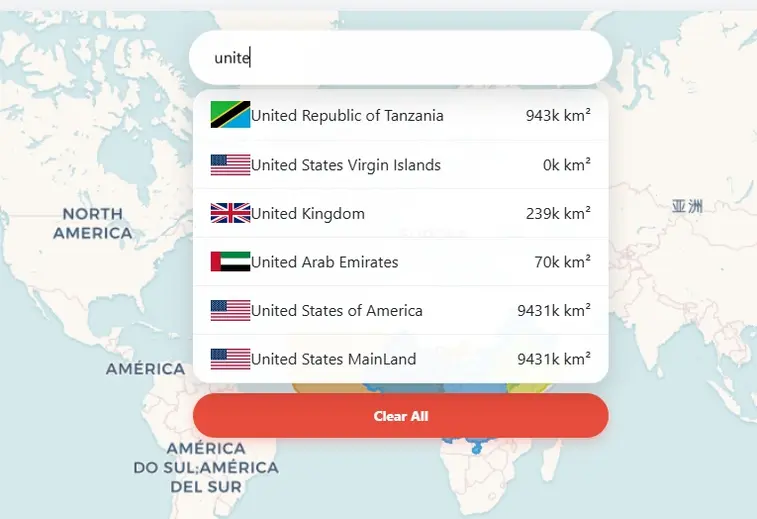
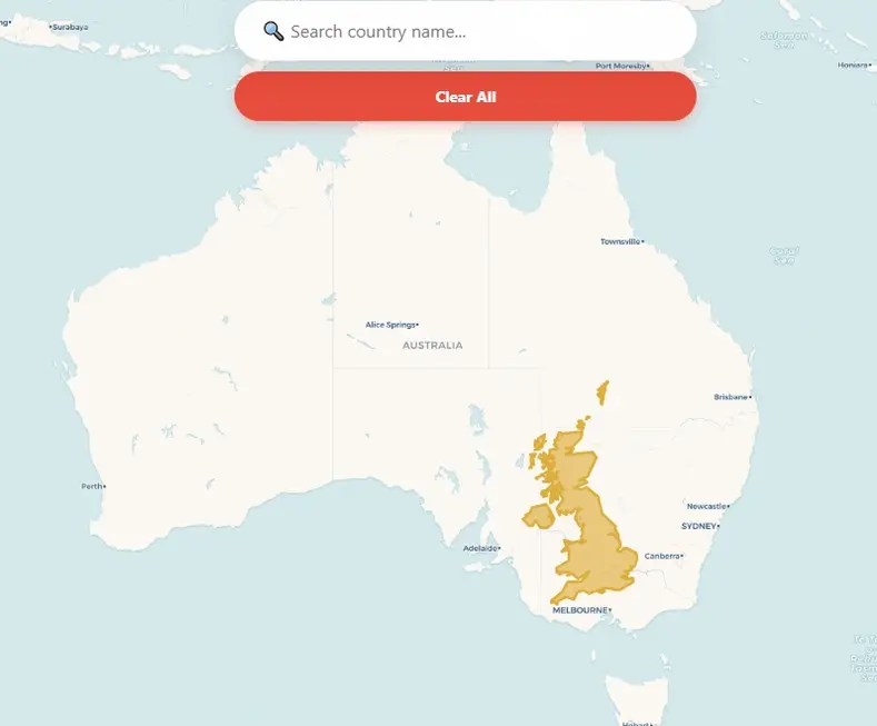
This interactive tool lets you instantly see the real size of any country without distortion. Search for a country, click it, and drag it anywhere on the map — the shape and scale correct automatically as you move it north or south, showing you exactly how large the country really is relative to anywhere on Earth.
Key Features
- Country Search — instant autocomplete with country flags and land area in km²
- Drag Anywhere — click and drag any country shape to compare its size with any region
- Projection Correction — shape and scale auto-adjust in real time as you drag north or south
- Distortion Meter — live tooltip shows current Mercator distortion % during drag
- Multiple Countries — add and compare as many countries simultaneously as you like
- Preloaded Examples — USA, China, and India are shown on Africa at startup
- Clear All — reset the map with one click or press Esc
- Fullscreen Mode — expand for a larger comparison view
How to Use — Step by Step
Start typing a country name in the search bar. A dropdown shows matching countries with their flag and area. Click to add it to the map.
The selected country appears as a coloured polygon. The map zooms to it. You can add multiple countries — each gets a unique colour.
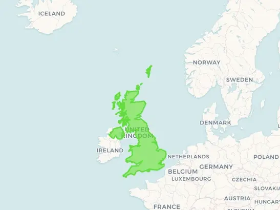
Click and hold any country polygon and drag it over another region. The shape rescales as you drag. A tooltip shows the area and current distortion % in real time.
Click "Clear All" or press Esc to reset the map to a blank world view. Search new countries and compare again.
A Brief History of Map Projections
The history of map projections is a 2,000-year struggle to solve a single mathematical impossibility: flattening a sphere onto a plane without tearing or stretching it.
The Ancient Roots
The Greeks were among the first to acknowledge the Earth as a sphere. Ptolemy (c. 150 AD) developed the first systematic projection methods in Geographia, using conic projections that preserved approximate distances for the known world.
The Mercator Revolution (1569)
Gerardus Mercator solved the navigator's problem by ensuring any straight line on the map was a line of constant compass bearing. The side effect: polar landmasses appear enormous. Greenland looks the size of Africa; Alaska appears as large as Mexico. Perfect for sailors, deeply misleading for everyone else.
Equal-Area Maps
The Gall-Peters Projection (1973) offered an equal-area alternative, ensuring every square centimetre of map represents the same area of Earth — at the cost of distorting shapes. The Mollweide Projection offers a similar trade-off, widely used in climate and scientific mapping.
Modern Compromises
The Robinson Projection (1963) and Winkel Tripel (1921) accept small distortions in area, shape, and distance rather than perfecting any single property. They "look right" to the human eye and are used by National Geographic and most educational organisations today.
Web Mercator Today
Ironically, Mercator made a comeback with the internet. Google Maps, OpenStreetMap, and virtually every web map use Web Mercator (EPSG:3857) because it preserves 90° angles at street intersections, making local navigation intuitive. At global scale, the distortion remains.
Frequently Asked Questions
Open Source & Credits
- Country data: World country boundaries enriched with area data (GeoJSON)
- Country flags: flagcdn.com
- Map library: OpenLayers — open-source web mapping
- Map tiles: CARTO Voyager, OpenStreetMap (fallback)